
It was time to redesign this website. It loaded too slowly on computer and phone screens, and frankly I was getting tired of the look. I found an uber-cool photo my webmaster turned into the top photo on every page, which meant the blue-styled top image that served as a logo and had been on this site since forever had to go. And I knew I'd have to hire a graphic designer.
The fellow I found was Bryan Leek, Jr., whose website is KualDesigns.com. He did a small logo I used in some places, such as on our contact page, then I had an idea to change it into something much bolder.
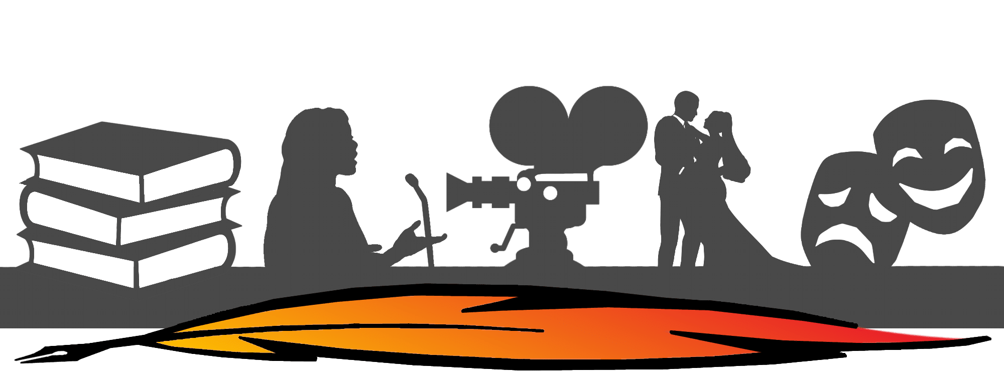
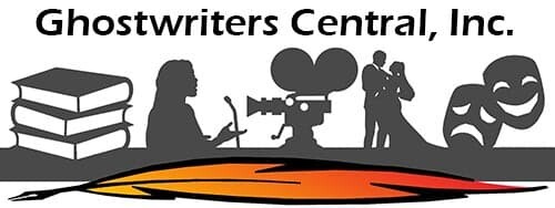
The main problem with logos is that they really don't mean anything. All too often they're just decorations. Someone in business thinks they need a logo so they pay an artist to make something meaningless and forgettable. Or they find some clip art. With writers, the logo is frequently a quill or old-school ink bottle or fountain pen. My thought was, let's show what we actually do. Books. Speeches. Song lyrics. TV and film scripts. Wedding speeches and vows. Stage play scripts. Left to right, that's us, above.
This logo gets noticed. It's unusual and explanatory. And the quill is flame colored. You've not seen anything like it before.
Bryan had some questions. I'm a writer/editor, not an artist. I tried to explain my idea in words but I wasn't clearly communicating with this talented fellow who thinks in images. So I drew some awful stuff in Photoshop to explain what I wanted. I can't even draw stick figures. What I sent poor Bryan was worse than bad. But, being the bright guy he is, he figured it out. A few days later I had his first draft. I asked for a few changes...and what you see above is what he gave me. It tells our story. This is what we do.
Let the logo summarize who you are.
Thank you, Bryan! :)
